White Space Isn’t Empty Space
White Space Isn’t Empty Space. It’s What Makes Design Work.
When you think of “good design,” you usually think about colors, fonts, logos, or flashy graphics. But one of the most important design tools is actually what isn’t there.
It’s called White Space.
And, studies have shown that proper white space can increase reading comprehension by up to 20%.
So what exactly is white space, and why does it matter so much?
What Is White Space?
White space (also called negative space) is the empty area around text, images, buttons, and other design elements.
Despite the name, it doesn’t actually have to be white. It simply refers to the breathing room in a layout.
Think about the difference between:
A cluttered flyer with tiny text crammed edge-to-edge
A clean, organized design with spacing between sections

Which one feels easier to read?
Most people instinctively choose the cleaner option, and there’s a reason for that. Your brain needs room to process information. When a design is overcrowded, your brain has to work harder to figure out where to look.
Too much text, too many graphics, or inconsistent spacing can create visual fatigue. People may skim past important information or stop reading entirely.
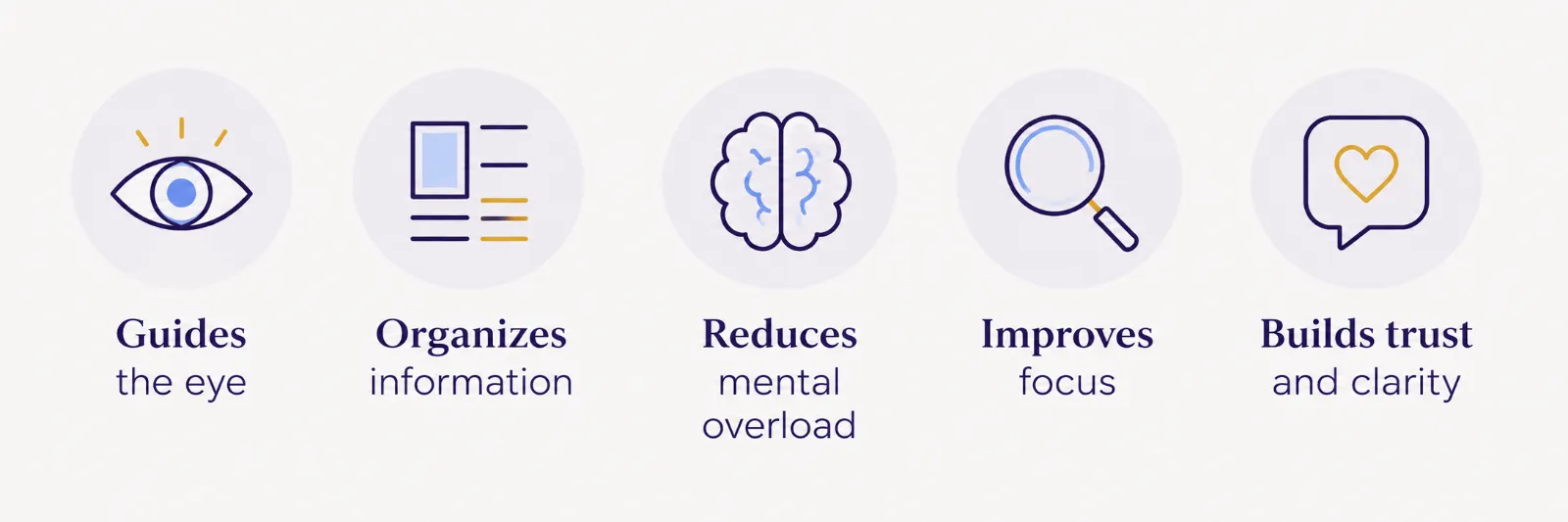
White space helps by:
Guiding the eye naturally
Separating important sections
Making content easier to scan
Reducing mental overload
Improving focus on key messages
In simple terms: spacing helps people understand information faster.
White Space Builds Trust
Clean layouts also tend to feel more professional.
Think about high-end brands. They rarely overcrowd their designs. They use spacing intentionally to create a polished, confident look.
When a design feels organized and easy to navigate, people are more likely to trust the business behind it.
More Content Doesn’t Mean Better Content
One of the hardest lessons in marketing is realizing that adding more information doesn’t always improve communication. Sometimes removing clutter is what makes the message stronger.
A simple, focused design often performs better than one trying to say ten things at once.
White space isn’t wasted space.
It’s a design tool that improves readability, comprehension, and overall user experience. In many cases, what you leave out is just as important as what you include.
If everything is fighting for attention, nothing stands out.
Why This Matters for Your Business
A lot of businesses make the mistake of trying to fit everything into one design. Every service. Every feature. Every phone number. Every sentence. The result usually feels overwhelming instead of informative.
At Marisol Marketing, we understand the importance of white space. Whether it’s a website, brochure, social media graphic, or other design:
Good white space can make a huge difference in marketing performance.